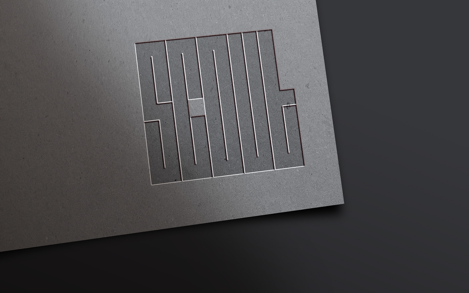
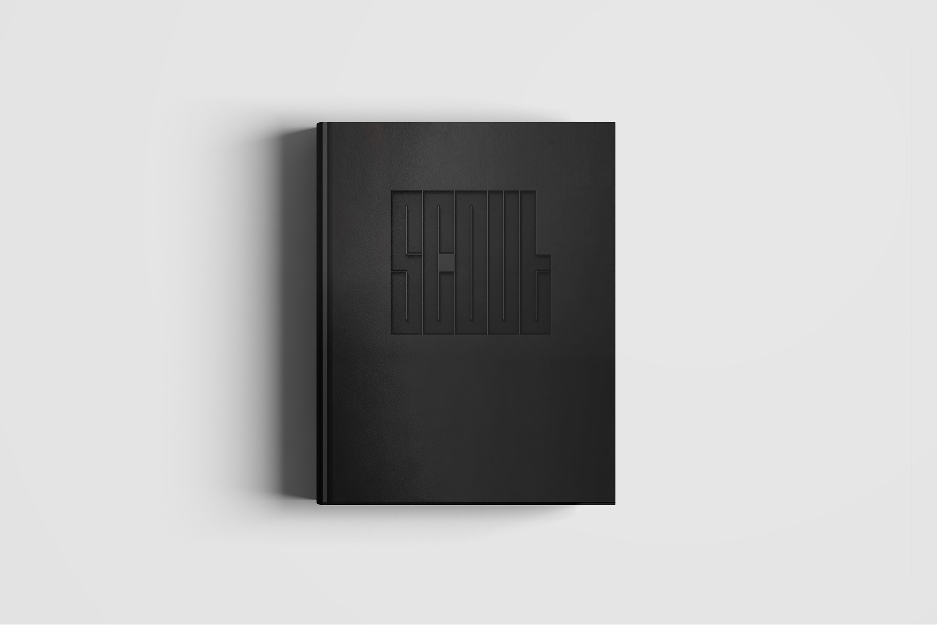
Scout logo deboss on cardboard
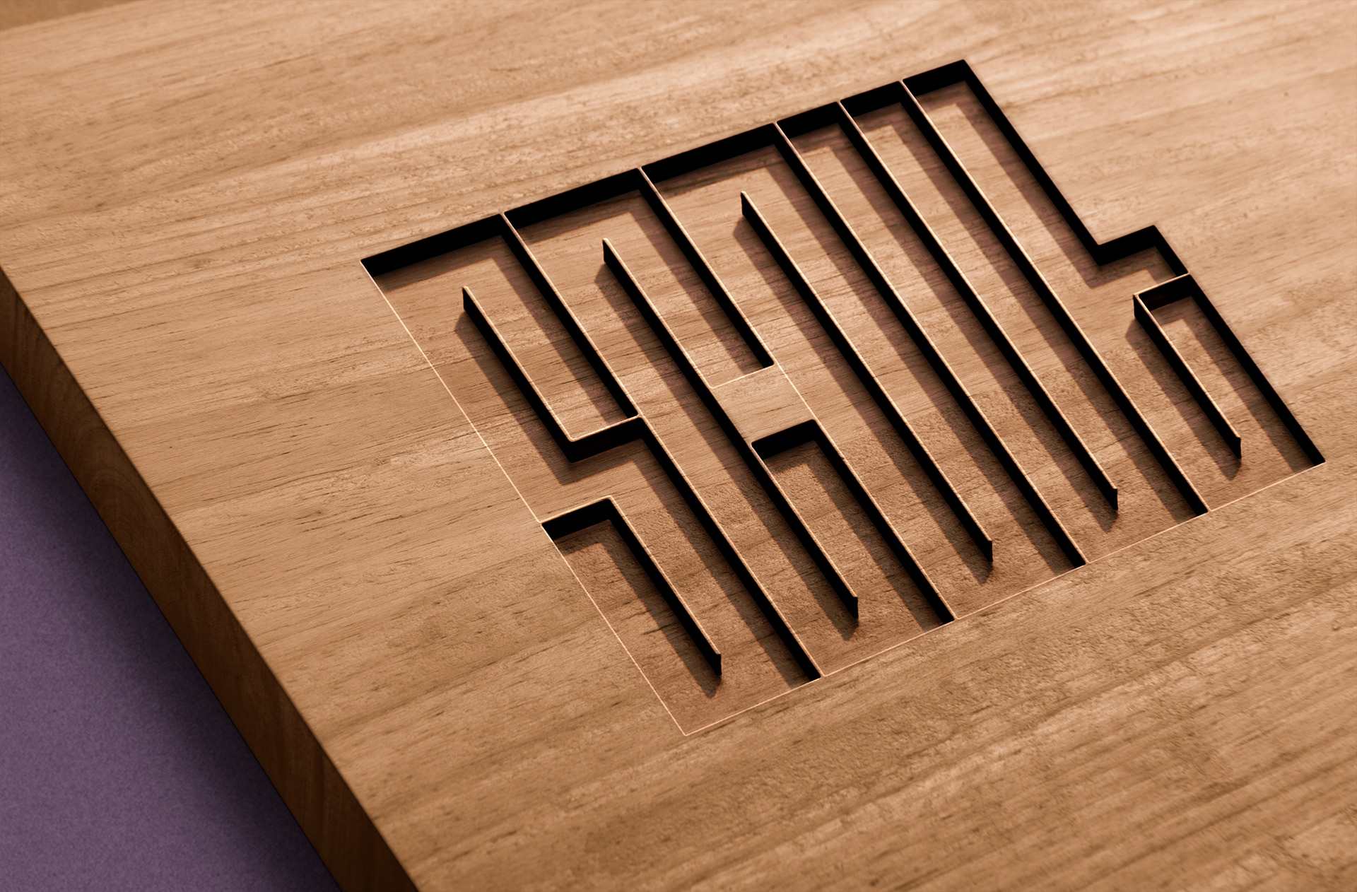
Scout logo deep etch in wood

Scout logo mock up in concrete
‘Scout’ : "to examine, inspect, or observe for the purpose of obtaining information"
The name of the publication was the inspiration behind the design of the typeface. When kerned tightly together, the letterforms created a visual likeness of a maze.
The name of the publication was the inspiration behind the design of the typeface. When kerned tightly together, the letterforms created a visual likeness of a maze.
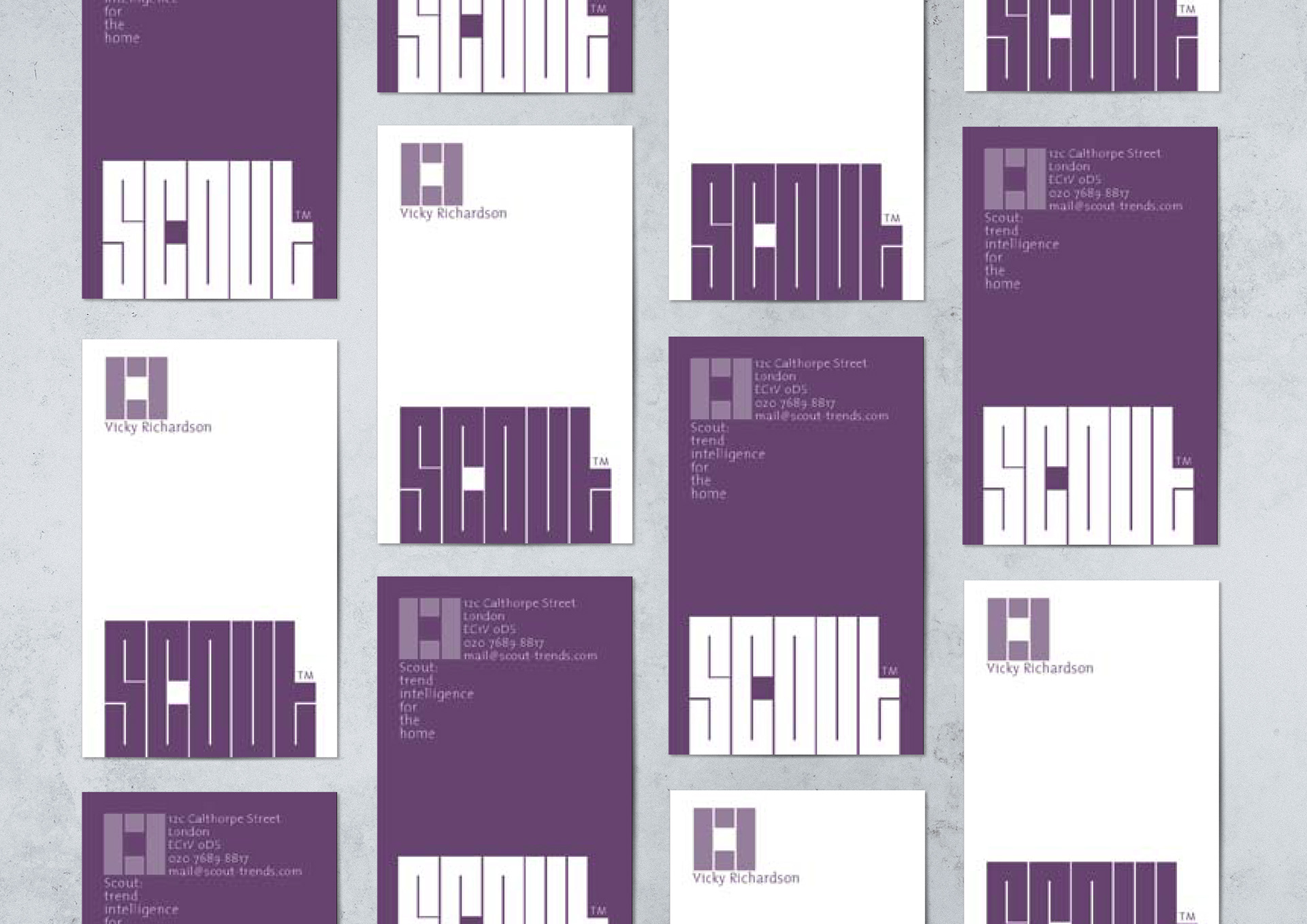
The typeface was built using square blocks that we called 'units'. The final unit number that formed the basis of the grid from which the Scout typeface was built was 8 units high and 3 units wide.
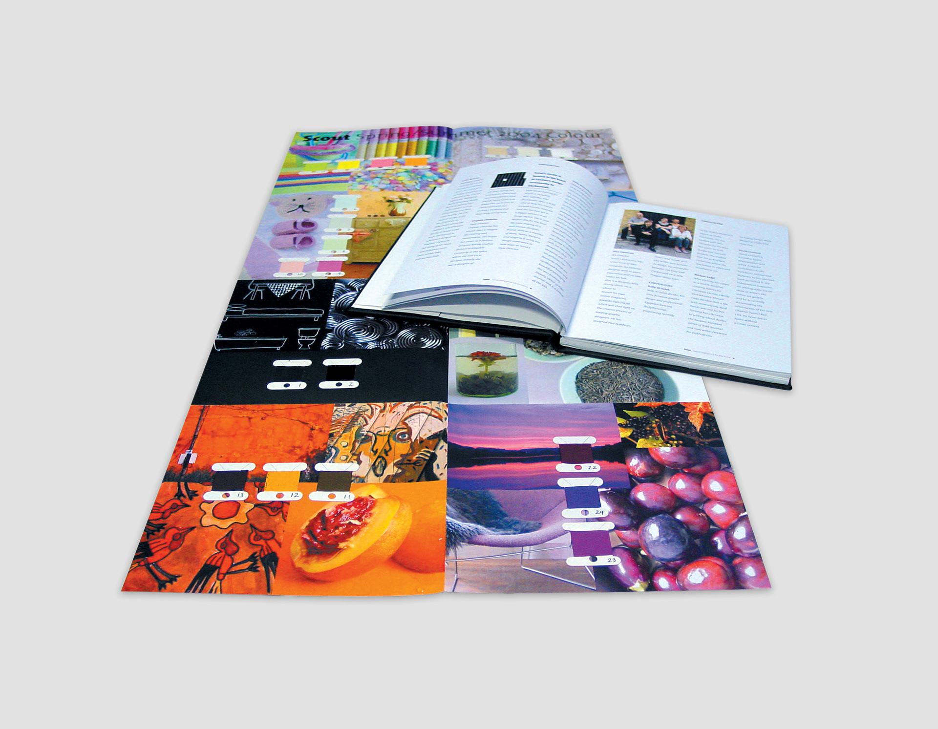

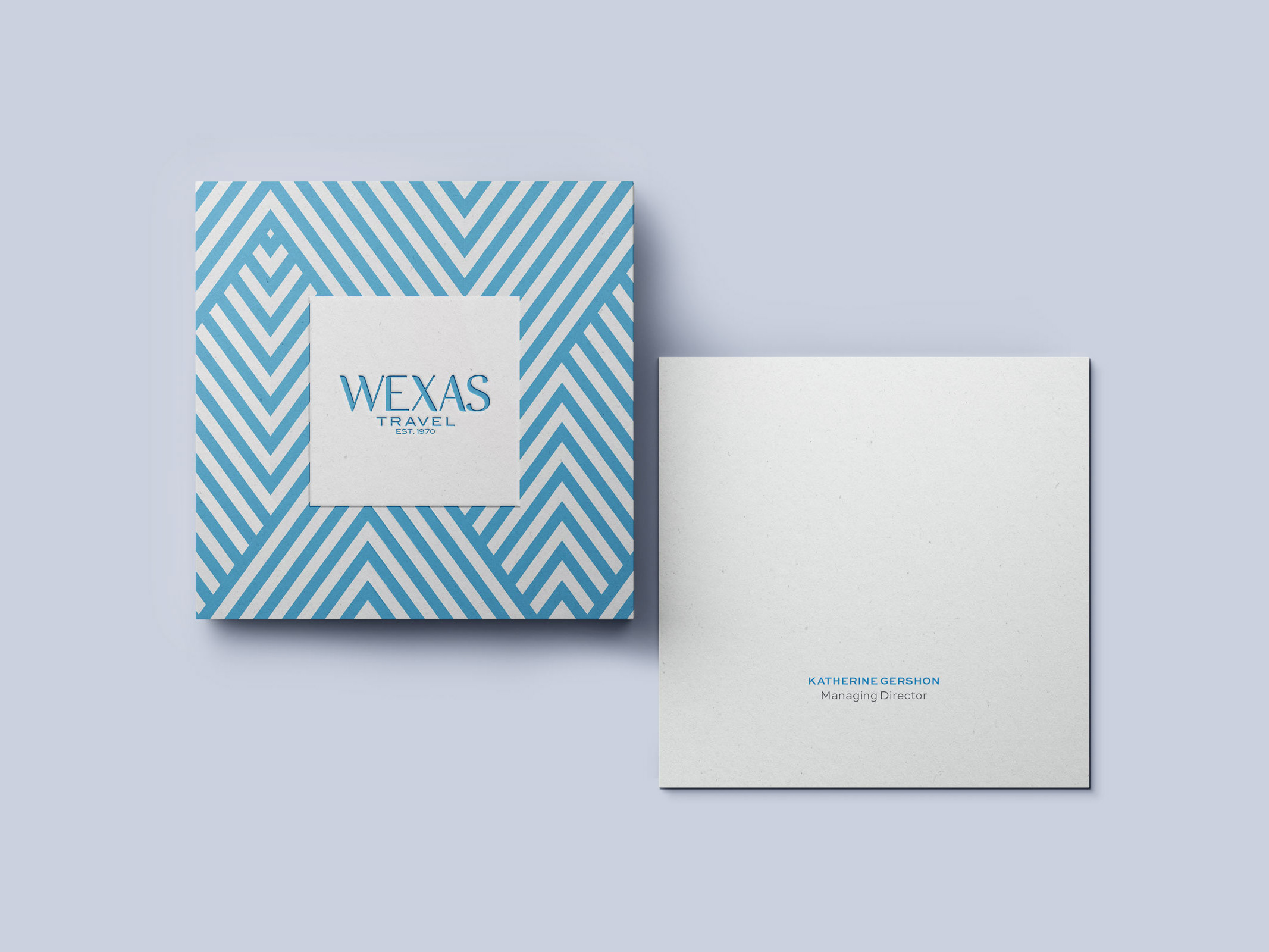
Working in partnership with another Art Director (Alexander Cameron) we soon realised that the standard format; ring bound folder with content pasted in (much like a scrapbook) did not reflect the cost of the product (the value of the content rather than its presentation reflected the price). We wanted to create a design that would both frame the content as well as visually represent its value.
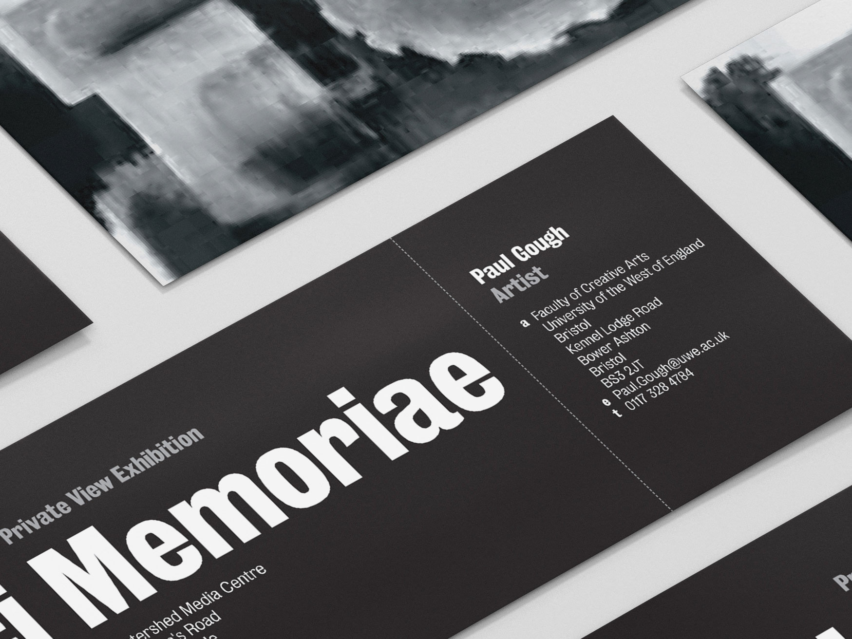
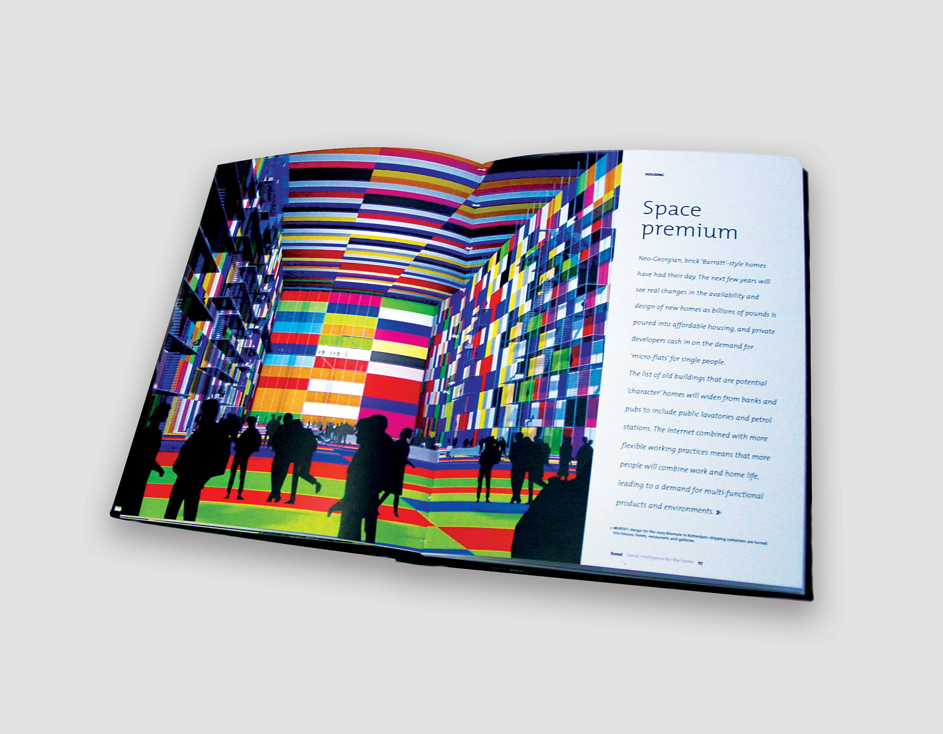
As well as a bespoke typeface for the logo, we created a hard bound book with a deboss cover. The inside pages were designed with clearly marked sections, use of fold out flaps for bitesize info as well as poster inserts for visual trends.
The aim was to create a publication of outstanding quality to reflect expertise and quality and to establish the Scout brand as an industry leader.
The aim was to create a publication of outstanding quality to reflect expertise and quality and to establish the Scout brand as an industry leader.