
The Virtuoso typeface alphabet designed for drop caps in features
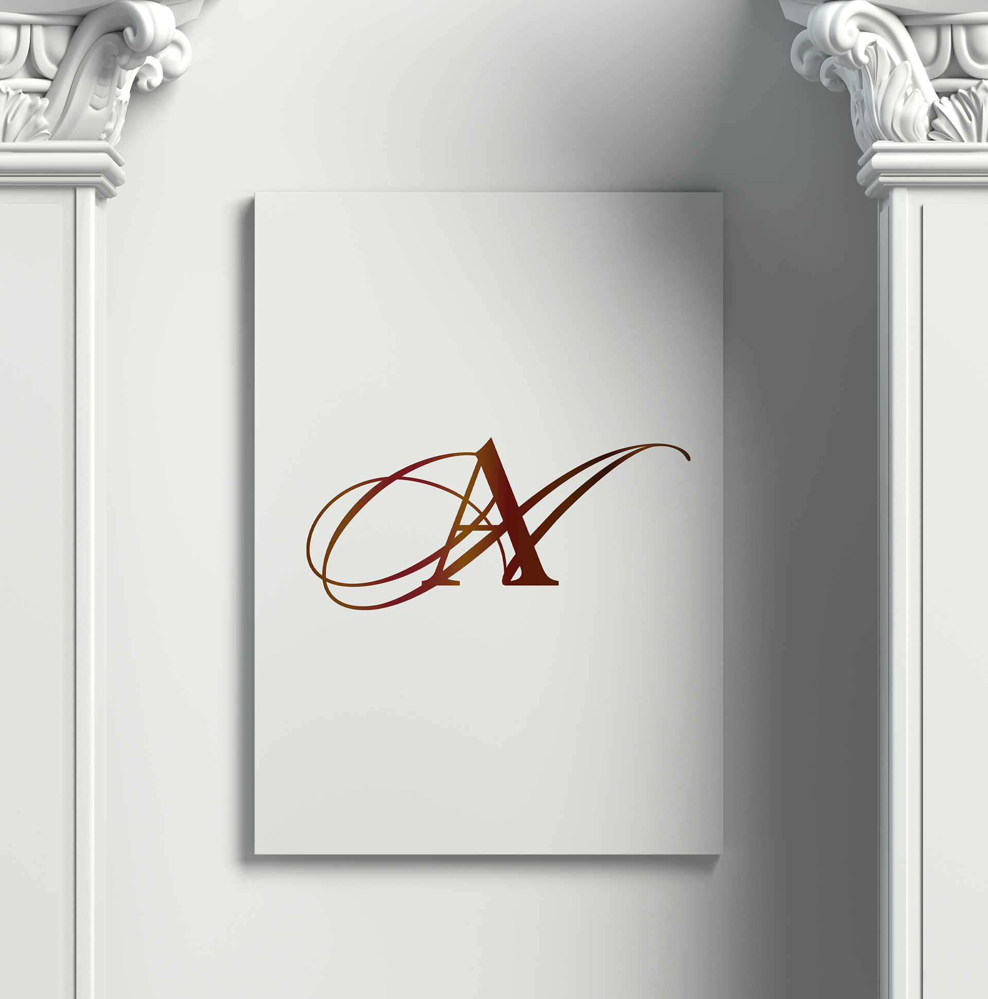
Virtuoso 'A'
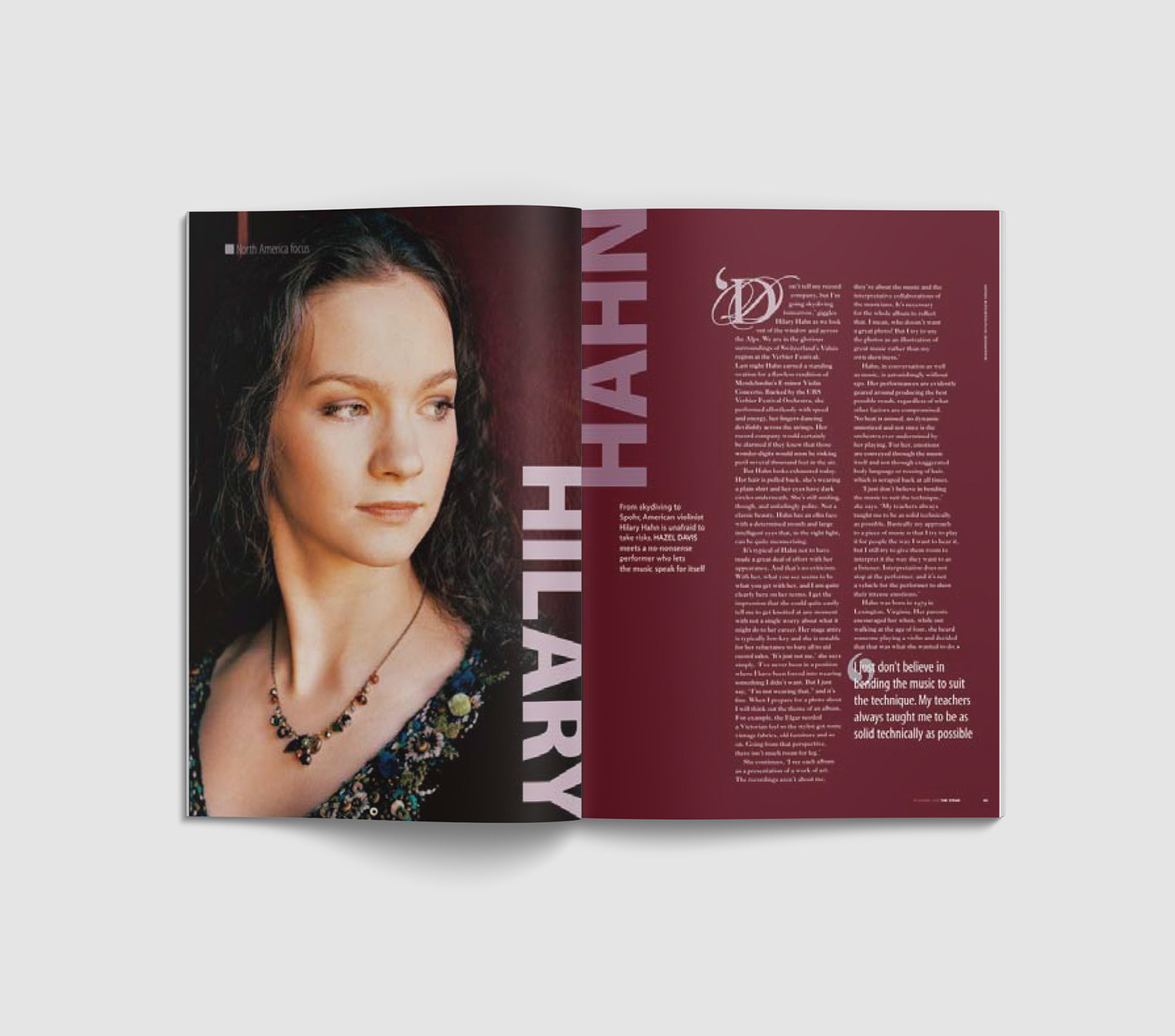
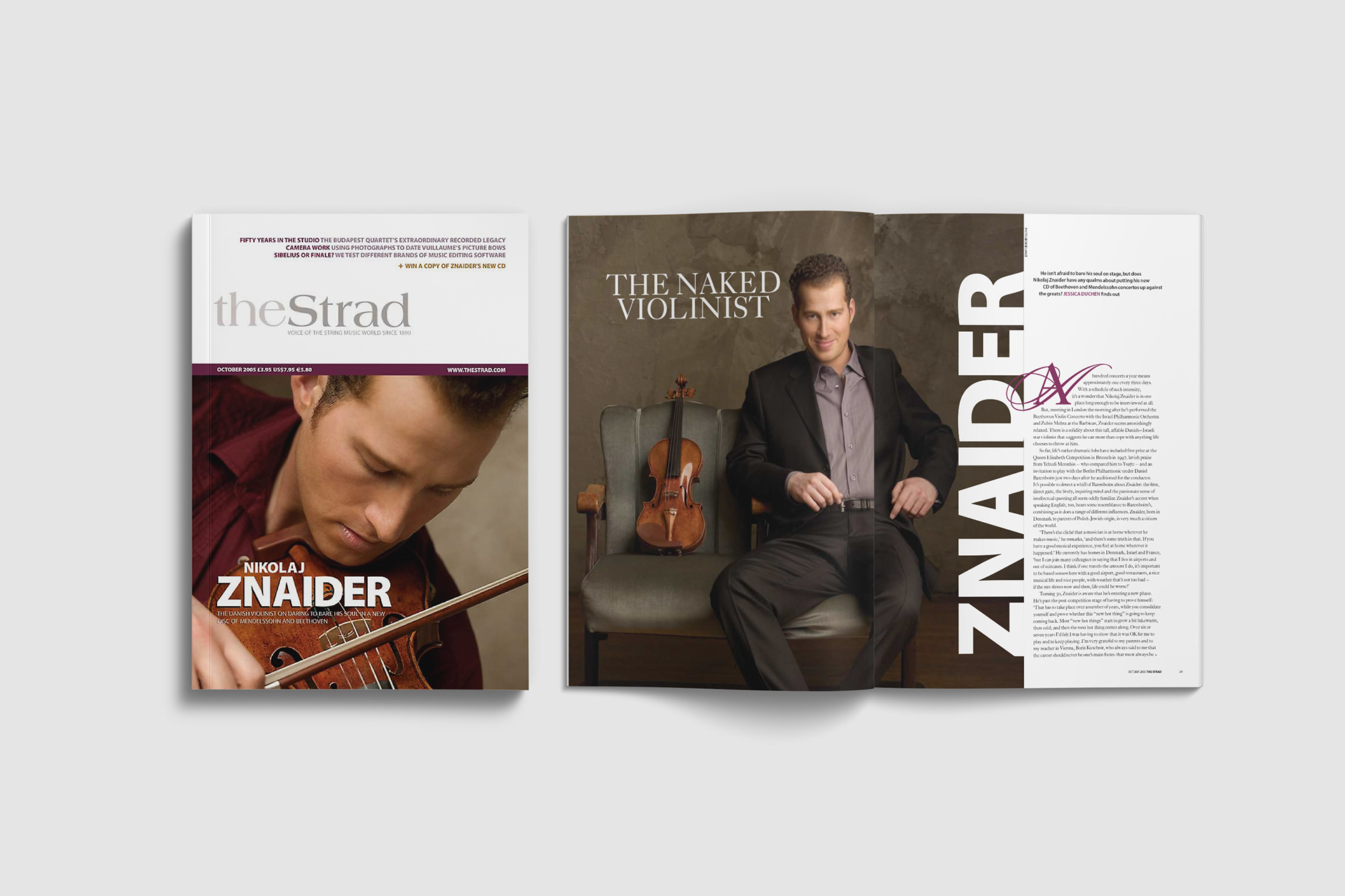
The Strad design originally had a very 'off-the-peg', templated look that did not reflect or compliment the content.
I felt it needed a sense of artistry and classical elegant. My first task was to design a bespoke typeface to be used for the leading features. This would help to visually distinguish them from other types of articles and create a different sense of pace and engagement.
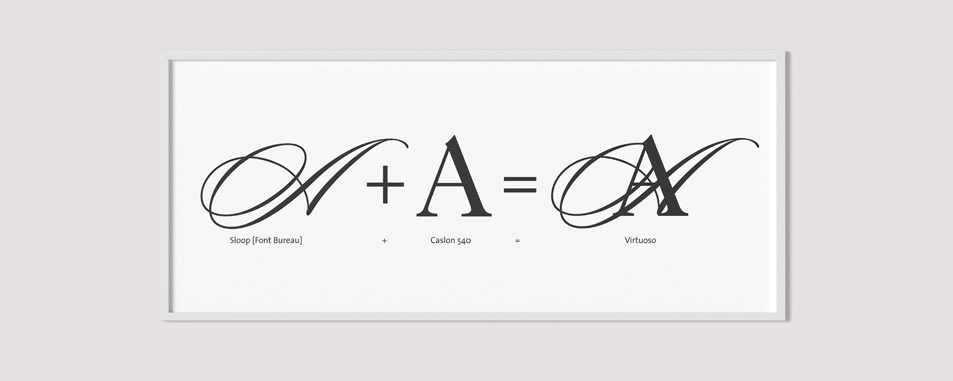
The drop cap typeface 'Virtuoso' was born out of a marriage of Sloop and Caslon. Caslon was also the body typeface chosen specifically for the feature articles.
I felt it needed a sense of artistry and classical elegant. My first task was to design a bespoke typeface to be used for the leading features. This would help to visually distinguish them from other types of articles and create a different sense of pace and engagement.
The drop cap typeface 'Virtuoso' was born out of a marriage of Sloop and Caslon. Caslon was also the body typeface chosen specifically for the feature articles.
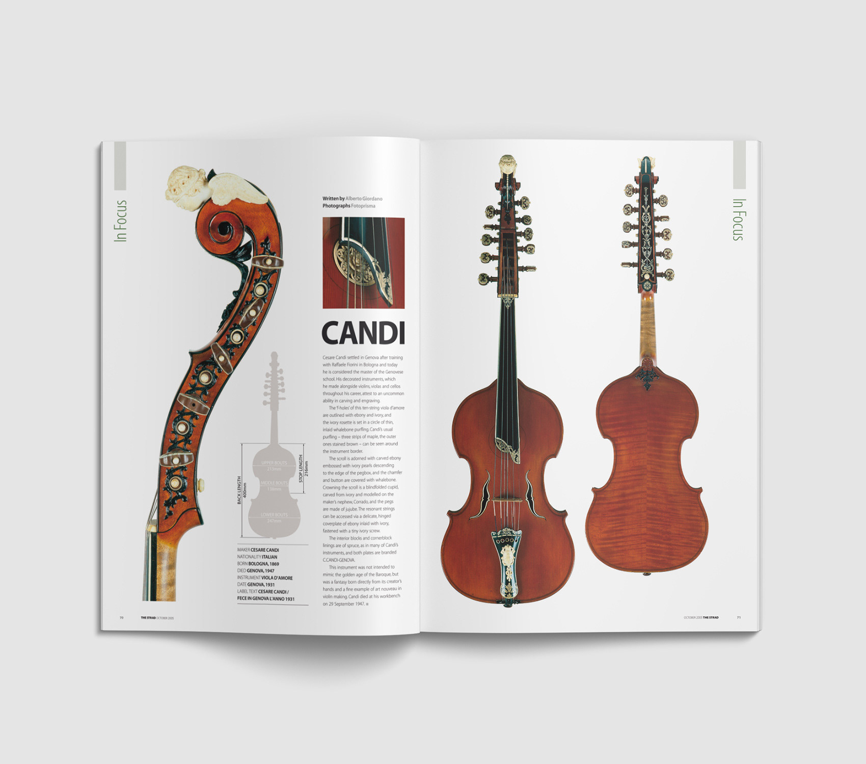
In Focus; a regular spread focussing on a violin of interest. As well as colour-matched photography, a silhouette of the violin served visual device to display the proportions (as opposed to previously used tablular format)